© Tillypad, 2008-2015
All other operating mode screens open within the main window.
Main window elements:
Main window header

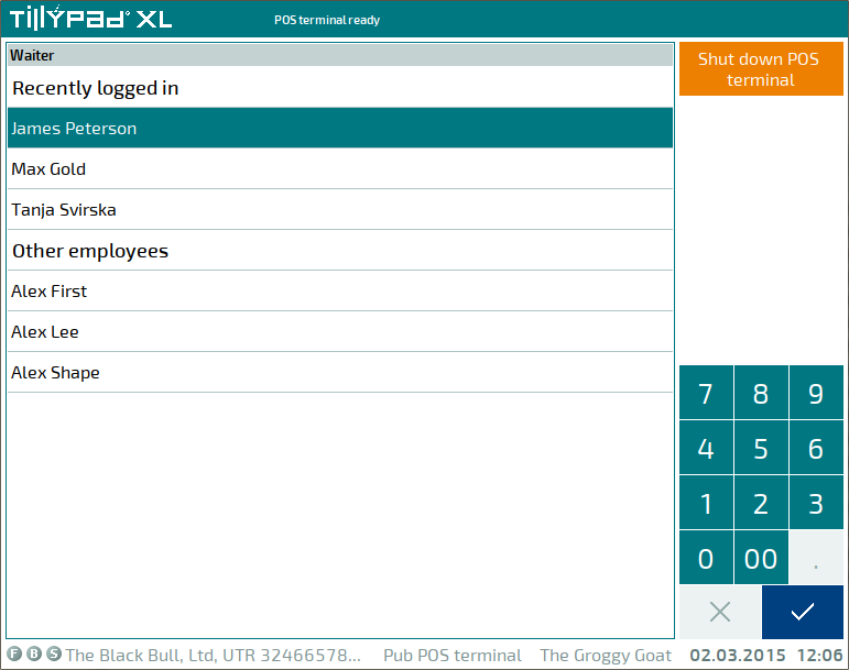
The header displays the system logo, mode header and subheader and the  button, which allows you to navigate to the login screen. If the device has messages for you to read, the header will display a special icon
  . The digit in the icon indicates the number of unread messages on this POS terminal.

Depending on the values assigned to the
HotAction
parameter, the left part of the header will display one of the following icons:  or
or  . indicates that you can navigate to another instance of the Tillypad XL POS program launched on this device by clicking or pressing the upper left corner of the work window.
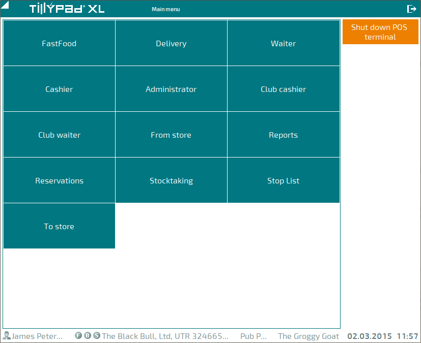
Figure 13.5. Main window header with the icon that allows you to navigate to another instance of Tillypad XL POS
However, if the button is present, when you press or click the upper left corner, the work window will rotate by 180°.
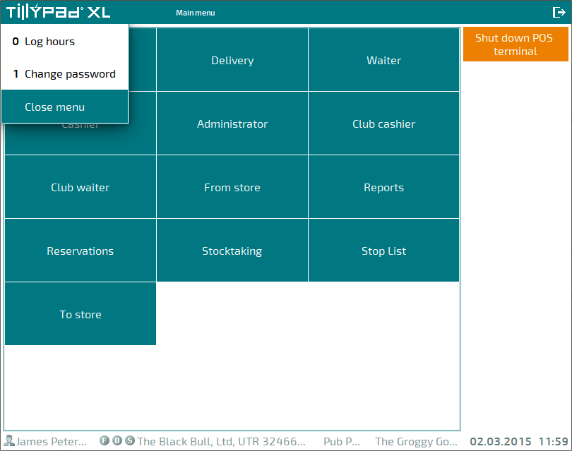
When you select the logo, the menu in the main window opens. This window contains commands that allow you to log hours worked and change the password of the current user.
Main window borders
The borders of the main window determine the size of its workspace. The program can be launched in full screen or window mode. The
FullScreen
group parameter determines what mode the window will be in.
FullScreen = ( Active = False ShowMouse = True )
Fullscreen mode is used by default. You can only change the size and borders of the main window in window mode.
Workspace of the main window
All POS operating modes open from the workspace. The size of the workspace is determined by the borders of the main window. The workspace does not include the main window's header and status bar. These two elements are always displayed in the main window.
Status bar
The status bar is always displayed on the bottom of the main window. It contains information about the licence in use and the current state of the POS terminal: name of the logged in user, name of the POS terminal, division to which it belongs, and current date and time.

The status bar always displays the current time. The remaining information depends on the values assigned to the
PointOfSaleName
,
DivisionName
, and
Date
parameters.
The information displayed in the status bar cannot be edited by the user.
The status bar can be used to show system messages, e.g. about the state of the operation execution or about program errors. In this case, the status bar will display the message instead of the names of the user, POS terminal, and division.

If the Date parameter is set to True, the following message will be displayed instead of the current date and time (while data is being retrieved from the server): Waiting.

If the Date parameter is set to False, the status bar will display the following message instead of the current date: wait.
If the wait time exceeds 5 seconds, the current date and time are replaced with the duration of the wait time (in seconds).
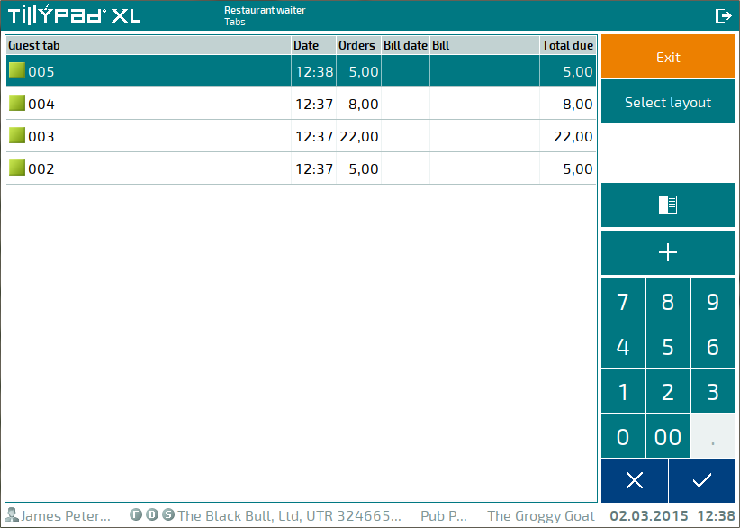
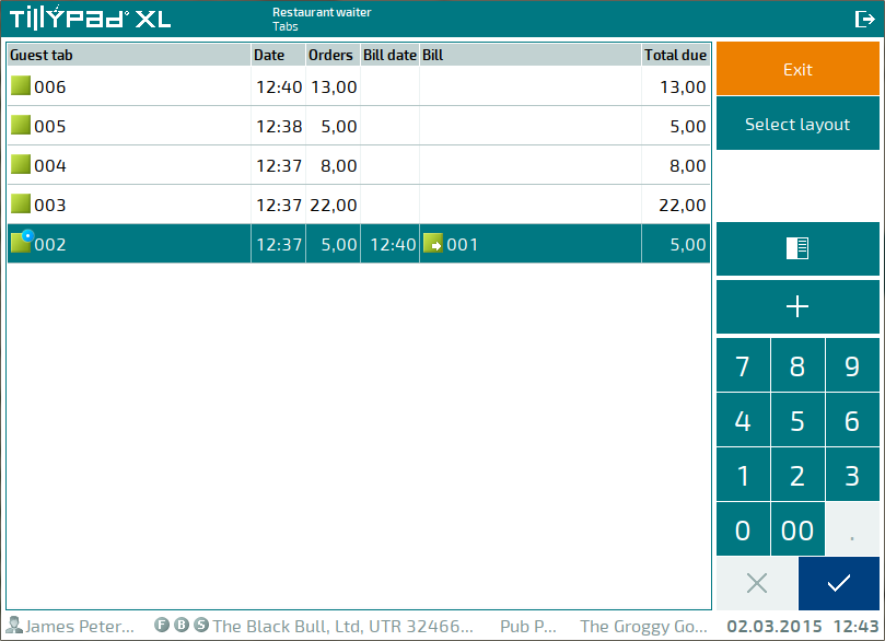
Button panel
The button panel appears if you are using a touch screen to manage the POS terminal. The buttons on this panel may appear in their actual size or as scaled-down pictograms. The panel can be located on the right or at the bottom of the workspace.
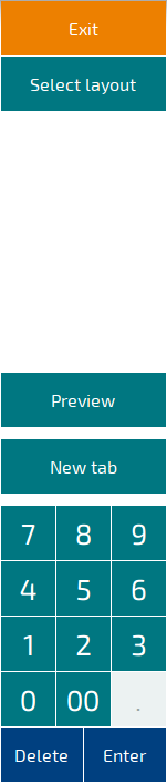
The panel with buttons also contains a numeric keypad and navigation buttons.
The buttons will appear as pictograms if the
SmallScreenSize
parameter is set to True. In this case, the panel displays a special button,  , which allows you to open or collapse the numeric keypad.

The button panel can be either vertical or horizontal. This depends on the
Disposition
parameter and on the width and height of the main window.

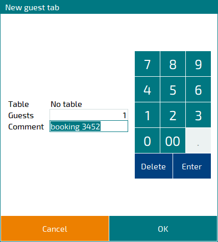
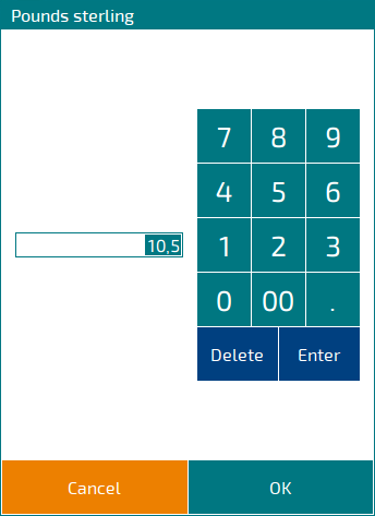
Numeric keypad
If at a certain stage you need to enter numerical information (payment amount, number of menu items ordered, etc.), the mode screen or the editor window will display a . The numeric keypad contains buttons with digits from 0 to 9, the decimal point, a double zero, and the and buttons.
The numeric keypad is also used in editor windows and selection windows with filters.
When navigation buttons appear as pictograms, the numeric keypad is collapsed by default. Instead, the following button, which allows you to control the appearance of the numeric keypad, appears: .
Pressing the button opens the numeric keypad.
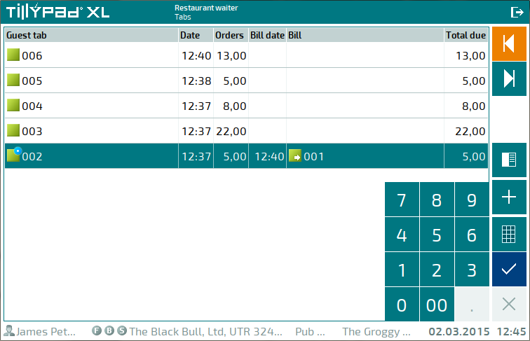
Pressing this button again will hide the numeric keypad image from the window.
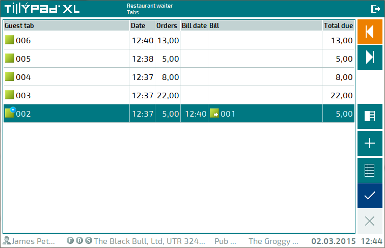
Navigation buttons
If the
OperateButtons
parameter in the POS terminal settings is set to True (which means that navigation buttons can be used), the mode screen will display navigation buttons. The number of buttons displayed depends on the POS terminal operating mode and its parameters.
Navigation buttons are used to select the previous or next system mode step or to complete steps. These buttons allow you to navigate between steps.
The number, names, and functions of the navigation buttons depend on the mode in use.
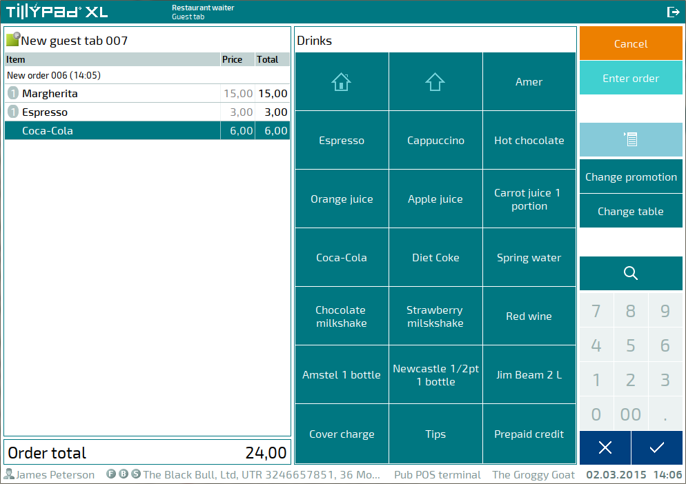
In the given example, the button allows you to navigate to the next step, the button returns you to the previous step, and the button takes you to the indicated step.
Navigation buttons can appear as pictograms.
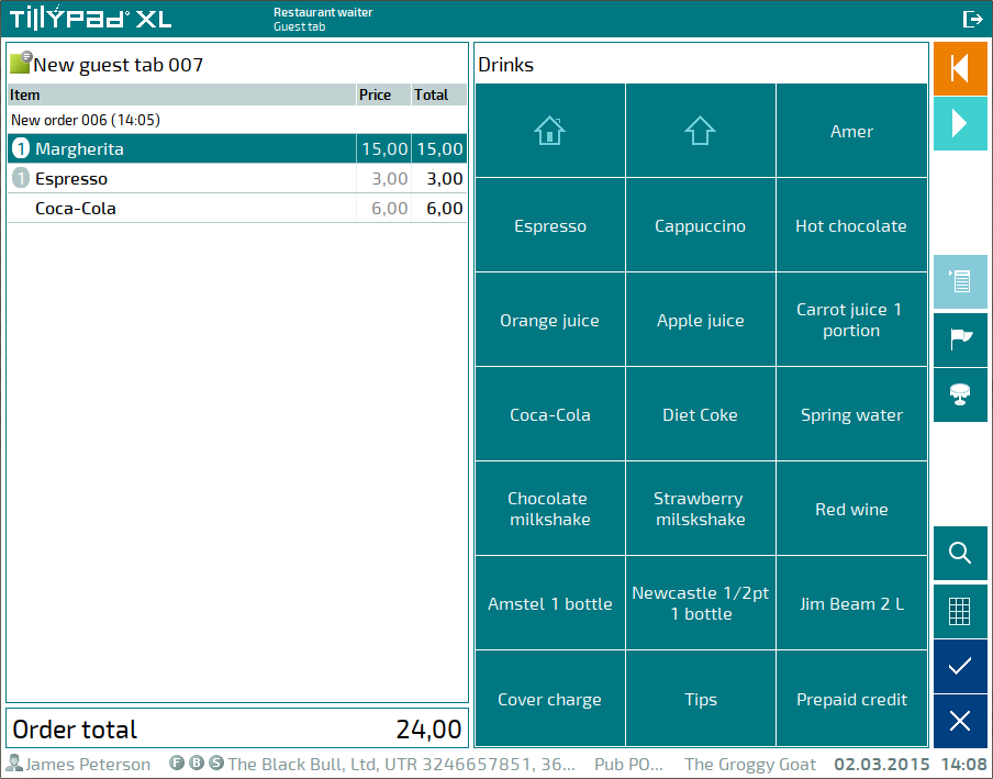
The functions of navigation buttons displayed as pictograms are shown in the table below.
|
Button appearance |
Button function |
|---|---|
|
|
Navigate to the previous step |
|
|
Navigate to the next step |
|
|
Show or hide the numeric keypad |
|
|
Select functions |
|
|
Delete (cancel) |
|
|
Select item (confirm) |


On-screen QWERTY keyboard
If textual information must be entered in the editor window (e.g. comments on menu items, orders, etc.), a fullscreen QWERTY keyboard will appear when you navigate to a text field.
It includes buttons that allow you to enter letters, digits, and special symbols, as well as to switch between languages and symbol types and to hide the keyboard.

The on-screen keyboard is hidden when you move to a field of a different type or close the editor window.