© Tillypad, 2008-2015
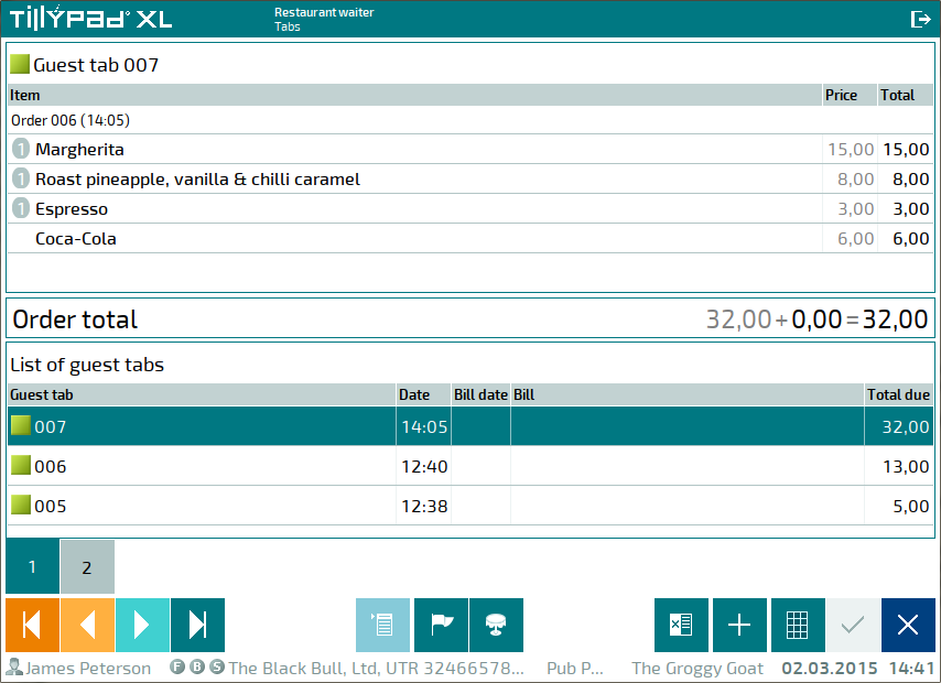
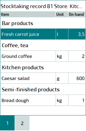
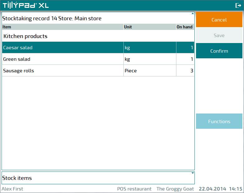
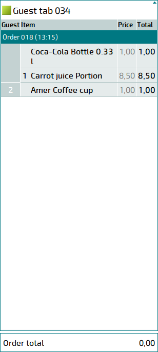
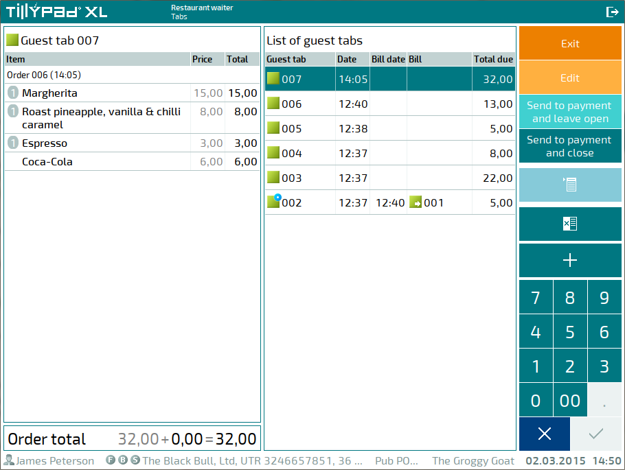
Data grids are used to display the information that is stored in directories and system lists. Some data grids are also used for selecting items.
The data grid can be a standalone item or part of a work window (for example, viewing window, selection window, etc.).
Information in the data grid appears in columns and rows. Data grid rows serve as its items. Columns display the items' attributes. The columns and their widths are determined automatically by the system, depending on the type of data they are meant to display.
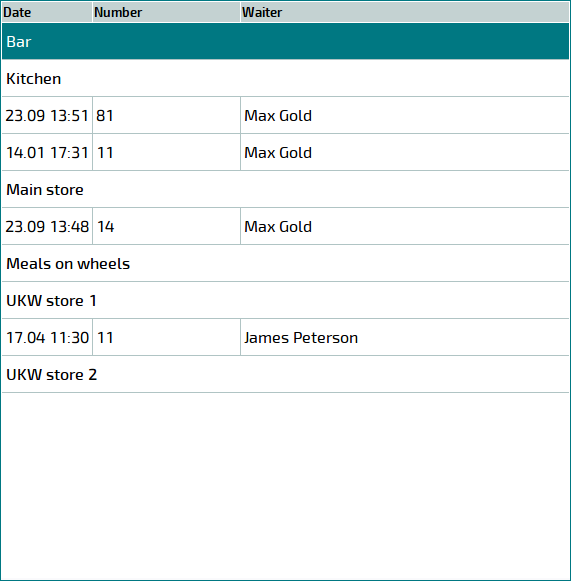
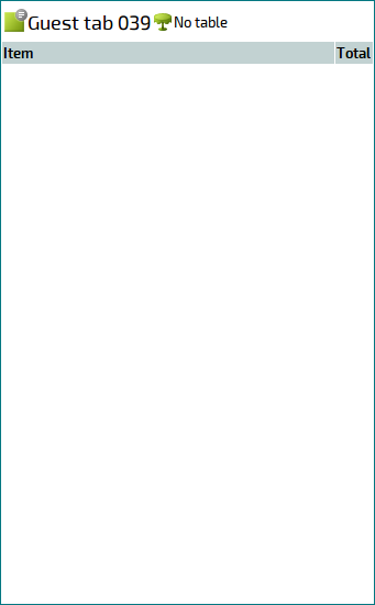
If the data grid is not populated, it will only display column headers.
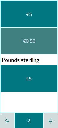
The data grid can be located on multiple tabs. Tabs are numbered starting with 1.
If the created tabs cannot all be displayed in the window, only one tab will appear together with the  and
and  buttons that are used to select the previous or next block of tabs.
If the
AllowGridMinimize
parameter is set to True in the POS terminal settings, some data grids may appear collapsed. When you expand one data grid, the other grid will be collapsed.
Data grid headers that can be expanded or collapsed contain one of the following icons:  or
or  . To expand or collapse a data grid, select its header.
If the data grid is expanded, its header contains the icon.
A collapsed data grid's header contains the icon.
Before you can carry out any operations on a data grid item, you need to select this item. You cannot select two or more items simultaneously.
To select a data grid item, depending on the POS terminal settings you might need to touch its row, press the appropriate button on the touch screen, or press Enter.
If the POS terminal is controlled by a keyboard, you can navigate between data grid items using the arrow keys. If the data grid is located on multiple tabs, you can navigate among them by selecting the appropriate tabs.
Location of data grids on the screens
Data grids can be located horizontally (one beside the other) or vertically (one below/above the other). By default, data grids are located horizontally.
The
Disposition
parameter determines whether you can change the alignment of data grids relative to one another.
|
|
Data grid location |
|---|---|
|
Auto |
The position of data grids relative to one another is determined automatically based on the height and width of the main window. |
|
Horizontal |
The data grids are located horizontally regardless of the height and width of the main window. |
|
Vertical |
The data grids are located vertically regardless of the height and width of the main window. |