© Tillypad, 2008-2015
The selection data grid is used to view and select items. It does not have a context menu.
Touching an item in the data grid selects it. In the selection data grid you can sequentially select any number of items.
If the
GridButtons
parameter (from the
Show
group) is set to False in the POS terminal settings configured in the
directory, the selection data grid will display rows that match the items.
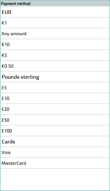
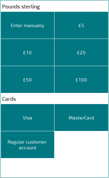
If the
GridButtons
parameter in the POS terminal settings is set to True, the data grids that are used to select stock items, menu items, or payment methods and payment method denominations will display buttons with names of groups and items instead of data grid rows.
If the data grid with buttons has a (the selection is made from a directory with groups), the current level (name of the group) appears in the header of the data grid.
When you open a group or subgroup to the data grid, two service buttons are added to the data grid:  () and
  ().
().
The button is used to navigate to the previous level. It is always displayed. If the current group does not have a parent, the button becomes unavailable.
The button is used to navigate to the original level.
The button is available in any group except for the source group and enables the user to navigate to:
the source group (if there is one),
the root group (if there is one),
the upper level of the directory.
If the data grid is used to select menu items, it can have either a service button or the button ( ).
).
The button is used to navigate to the upper level of the menu. You can specify the source and root menu groups on the
Menu settings
panel in the POS terminal window.
The button is displayed in the source group and enables the user to navigate to:
the root group (if there is one),
the upper level of the menu.