
© Tillypad 2008-2014
The following interface elements are used in work windows:
data grid with a context menu,
Work window header
The header of the work window displays the name of the window, an icon that illustrates main data grid items, and standard buttons.

Using the standard button  you can pin the window on the pin panel. The
  button allows you to maximise the main window of the program, whereas the
  button closes the window.
The header of an active work window contains a system menu to control this work window and to navigate to other work windows.
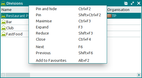
The context menu of the work window header contains the following commands:
(Ctrl+F2) – pins the window to the pin panel and closes it.
The same action is carried out when you press the standard button
.(Shift+Ctrl+F2) – pins the window to the pin panel without closing the window.
(Ctrl+F3) – maximises the work window (makes it fullscreen).
The same action is carried out when you press the standard button
.(F3) – increases the height and width of the window in one step.
(Shift+F3) – decreases the height and width of the window in one step.
(Ctrl+F4) – closes the work window.
The same action is carried out when you press the standard button
.(F6) – navigates to the next opened work window.
(Shift+F6) – navigates to the most recently opened window.
(Alt+F2) – adds the command to open the work window to the in the main menu of the program.
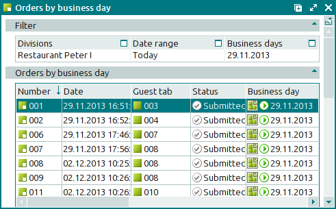
Work window data grid
The data grid is used to manage objects of the database. Each row in the data grid corresponds to one object, and each column matches one attribute of the object.
Some data grids contain only items of the same type; others can include items of different types. For example, the data grid of the directory contains only categories that can be assigned to stock items, whereas the directory includes menu items, menu groups, and modifiers.
Data grid items are managed using the context menu. It incorporates commands to manage the items of the data grid, as well as commands to configure the appearance of the data grid.
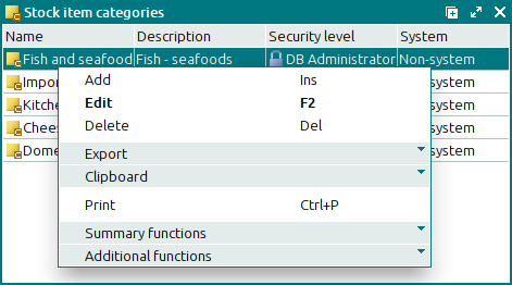
The context menu of the data grid contains the required commands and menus, as well as additional ones that are determined by the specific features of the selected items. As a rule, the context menu includes the following commands:
(Ins) – adds a new item to the data grid.
(F2) – edits the existing data grid items.
(Del) – deletes items from the data grid (permanently or to the ).
– menu with the commands to export files into an external file or update package.
– menu with the commands to operate the clipboard.
(Ctrl+P) – generates print layouts.
– menu with the commands to manage the summary functions of the data grid.
– menu with the commands to operate the data grid.
The data grid can also include: the summary functions panel, column filters panel and a grouping area. The summary functions panel allows you to view the results of calculations for a particular column. Using summary functions, you can calculate the total number of entries in the data grid, the number of items, the total for a column, and the maximum, minimum or average value in a given column. The Filter panel allows you to view the conditions that are taken into account when items are displayed in the data grid. The grouping area is an area into which you can drag and drop the names of the columns that will be used to group data in the data grid. If data in the data grid are grouped by one or more columns, the summary data can be displayed both by item groups and by all data grid values.
For more information on data grids and their commands and menus and for guidelines on how to work with these grids, please refer to the Data management in Tillypad XL Manager chapter.
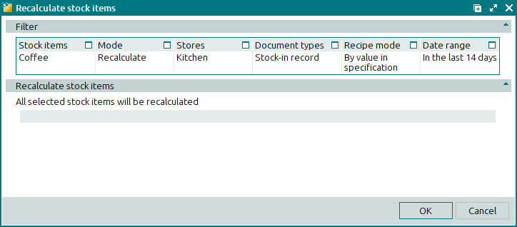
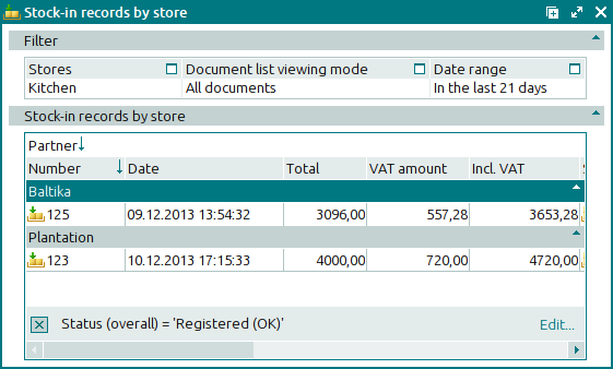
Filter parameters panel
Some work windows require you to run a filter wizard before you can open them. The filter wizard allows you to narrow down the data that will appear in the data grid. This limits the amount of data that will be displayed and facilitates searches in the data grid.
The Filter panel displays parameters, each of which corresponds to a filter wizard step. You can change the values selected at any filter step by pressing the  button.
For more information on how to work with the filter wizard, please refer to the Data management in Tillypad XL Manager chapter.
Progress bar
The progress bar is used in the work windows where you perform operations on documents. It is used to notify the user about the progress of the initiated operation.