- New Tillypad XL POS design
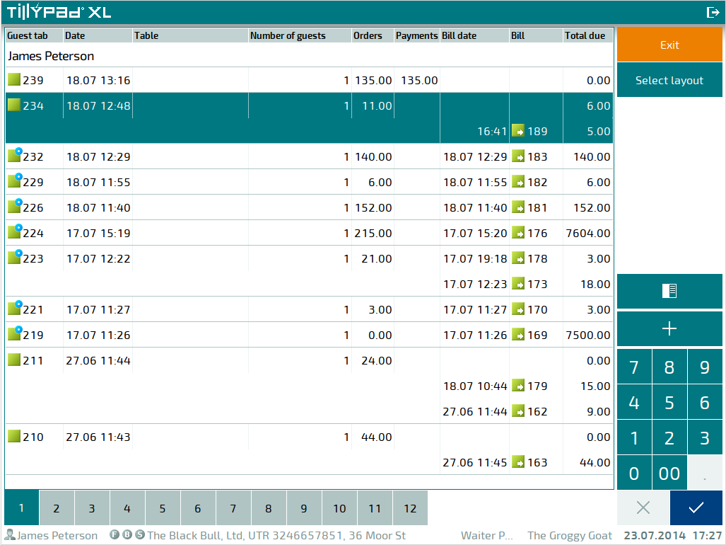
- List of guest tabs in Tillypad XL POS
- New design of the guest tab specification
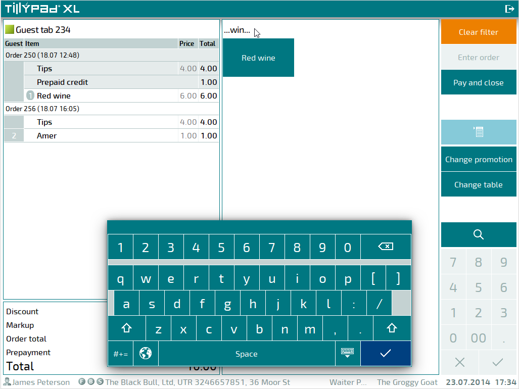
- POS terminal screen keyboard
- Long pressing the POS terminal screen
- Displaying pictures for tables, table types, and seating and device layouts on POS terminals
- Saving the Tillypad XL POS state
- Coin/note buttons
- On-screen button formats
- Pictures on screen form buttons
- Using main and additional printers on POS terminals
- Managing orders and guest tabs in Tillypad XL POS
- Working with auto-orders
- Changing the number of menu item portions in submitted orders
- Automatic discount recalculation
- Joining bills during guest tab payment
- Fiscal and non-fiscal payments in one receipt
- Payment refunds
- Inheriting screen forms
- New features of Fast Food mode
- New features of Restaurant waiter mode
- New features of Club cashier mode
- New features of Stocktaking mode
- New features of Administrator mode
- New guest tab statuses
- Adding stock and menu items sequentially to specifications
- Reservations
- Selecting screen forms on the keyboard or in another screen form
- Selecting promotion categories on the keyboard or in the screen form
- Additional stock item units of measurement for different document types
- Playing video on customer displays
- H.264 protocol support
- System table types
- iButton reader driver
© Tillypad 2008-2014
The design of Tillypad XL POS has been completely updated in the new release. The program uses a new, highly legible typeface.

Some buttons now display intuitive symbols instead of captions.
|
|
|
|
|
|
|
|
|
|
|
|
|
|
|


You can change the sizes of all typefaces using the private parameters of the POS terminal software module. However, to match the size of the typeface to the sizes of control elements, you only need to use the ScreenHeight parameter configurable for the POS terminal.
Quick log out and navigation to the start screen of Tillypad XL POS
The Tillypad XL POS program window header contains the  button, using which the user can quickly log out. After you press this button, the start screen will open, and the program will navigate to the waiting for login mode.
Licence information in the status bar
The status bar contains information about the licence used by the Tillypad XL POS program instance on the given POS terminal.
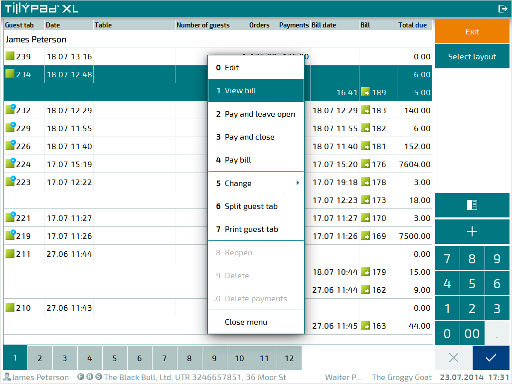
Numbering context menu options on the POS terminal
If a keyboard is used as the input device for the POS terminal, each context menu option is given a number between 0 and 9. For additional commands, a decimal point precedes the digit (e.g. .1, .2).
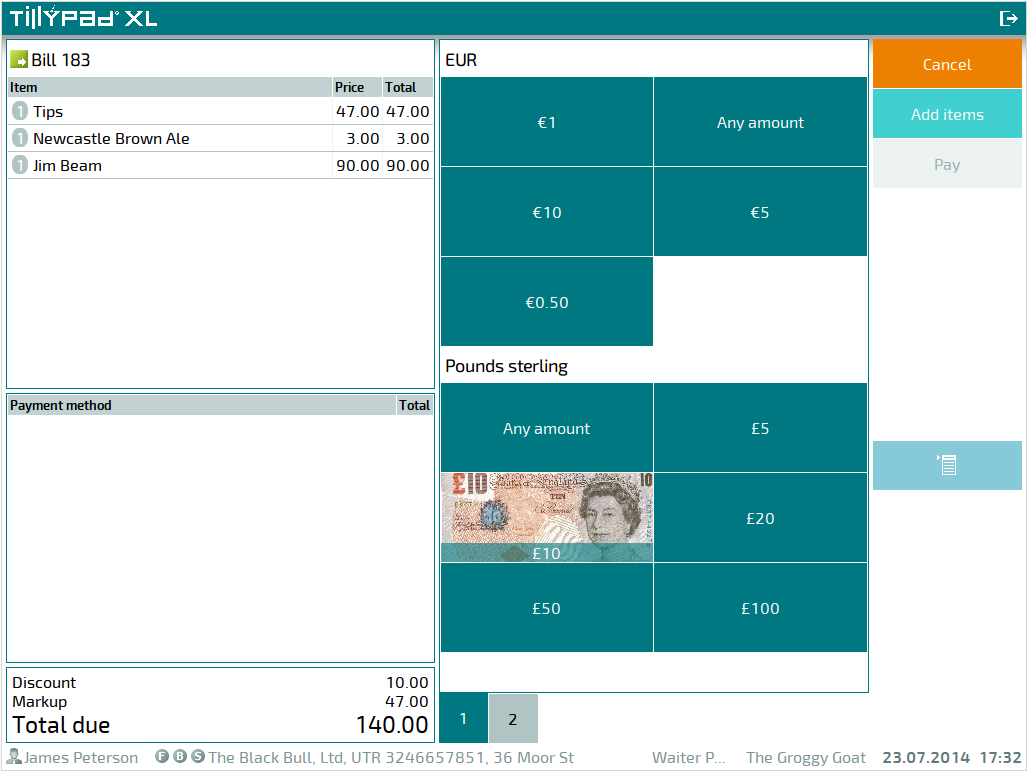
Bill specification in the payment screen
In the top left part of the screen, a data grid showing the elements of the bill in payment appears. This allows you to see which bill specification items the client is paying for.
Search in the menu data grid
When working with the menu data grid, you can search items by their names. Pressing the  button opens the screen keyboard. Searched values are displayed in the top part of the data grid. The list of menu items is filtered by the entered symbols.
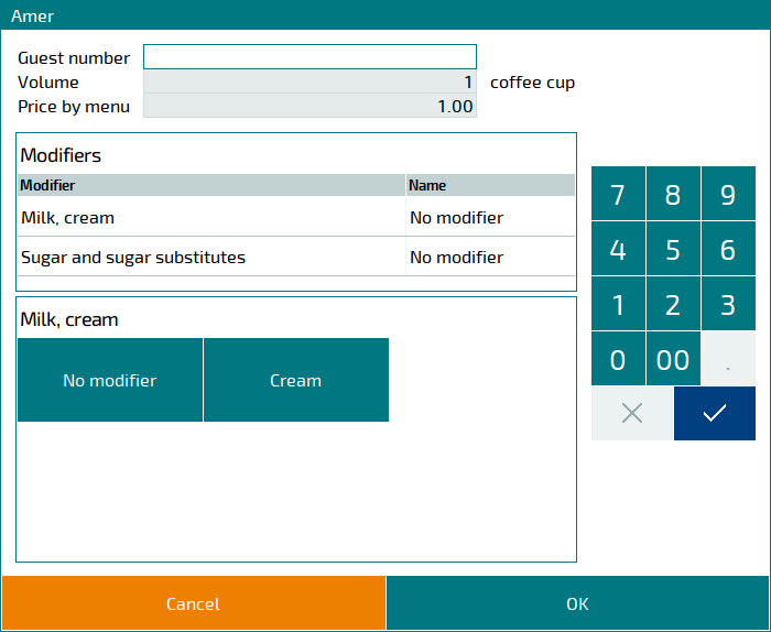
New design of the window for menu items with modifiers
Menu items that are sold with modifiers now have a new window design. This window contains a list of modifier specification item groups and a list of modifier specification items that belong to this group. The list of specification items also displays a button or row that allows you to choose not to select a modifier specification item.
Device operation status window
During payment, the state of an operation executed on a device is displayed in a special window.
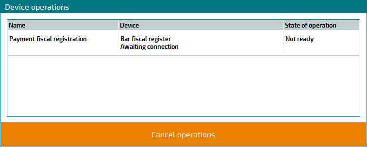
This window appears if the AlwaysShowPaymentDialog parameters of the
,
,
,
, and
modes are set to True.
However, if the parameter is set to False, this window will appear only if there are issues with the device.
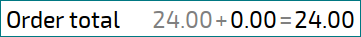
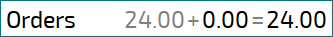
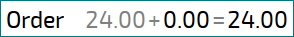
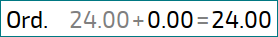
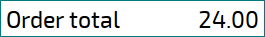
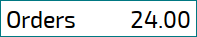
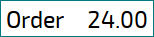
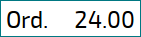
Total line abbreviation rules
Rules have been defined to control how information in the total line changes depending on the width of the row. These rules allow you to save as much of the information in the total line as possible by shortening the additional information.
At the first stage, the name of the total amount is shortened, e.g. Order total – Orders – Ord. At the next stage, the value of the total amount is shortened, while the name of the total amount returns to its default. At the final stage, the name of the total amount is shortened again, just like at the first stage.
Inactive buttons on the POS terminal screen
The appearance of unavailable buttons changes. If the button has no picture, the inactive button will have a light grey background (code: ecf2f2 in the hexadecimal colour system). The caption uses the blue grey font colour (code: 9ab0af).
Background pictures on unavailable buttons are displayed with a higher brightness (they are 30% lighter than the background pictures on available buttons).
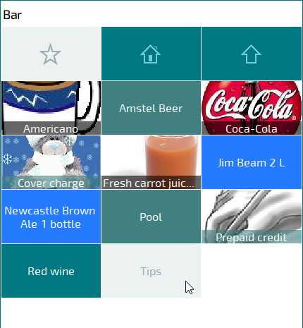
On-screen button design
Consistent style rules were set for the on-screen buttons on the POS terminal.
If the button has no background picture, the text will be centered horizontally. Vertically, it will be aligned according to the height of the button.
If the button has a background picture, the text is centered horizontally. Vertically, it is aligned to the bottom edge of the button. The text appears on a semitransparent base (the translucency ratio is 40%). The base colour corresponds to the selected button background colour. The default colour is grey.
The background image is scaled proportionally to the size of the button. The aspect ratio remains the same.