
© Tillypad 2008-2014
After the program is started, its main window opens. This window contains an empty workspace where subsequent windows will open.
When the program is opened, the main menu appears on your left. This is an expandable tree list with various options.
To hide the or make it reappear, click on the Tillypad XL logo in the header of the main window.

The contains commands, which are grouped by the program's sections (subsystems). These commands are used to open directories, lists, etc.
The most frequently used commands can be added to . Favourites are placed on top of the main menu above the standard entries.
The also displays the history of selected commands; these commands are listed temporarily on the menu and allow you to reopen recently closed windows. They are placed below the standard menu entries and can also be added to .
On the bottom of the main window you will find the status bar, which shows the current state of the system. It displays the name of the Tillypad XL segment, the name of the logged-in user, information about the states of licences, and the current date and time.
When you open a new work window, the previously opened window closes automatically in order to make space for the new window. This does not apply to windows with unfinished operations (for example, entry, editor, and selection windows do not close automatically). If a viewing window has been closed, you can easily reopen it from the selection history in the main menu.
You can pin a work window to the pin panel by pressing the  button in the window header. You can reopen the window from the panel at any time.
The pin panel is located on the right side of the main window. The panel displays thumbnails of the pinned windows, and the  button shows how many are located on the panel.
To hide an opened panel or show a closed one, press the  button, which is located in the main window header.

The actual management of the program is carried out in the program's work windows and item windows.
Viewing windows, selection windows, and operation windows are considered to be work windows. Data in work windows (except for operation windows) are represented in the form of data grids.
Item windows are dialog boxes with fields and buttons. They can be opened from work windows and are used to add or edit data in the program.
The data grid serves as the primary form of data representation.
In some cases, a filter wizard appears before a data grid can be displayed. After the wizard is run, only the data that match the selected filter parameters will be displayed in the data grid. The filter wizard is used to select which data will appear in the grid.

After the filter wizard is executed, the selected parameter values will be displayed in the Filter panel of the opened window. You can change the filter parameter values while working with the data.

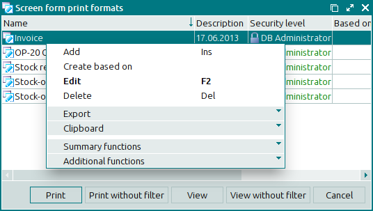
Data grid items are managed using the context menu, which can be opened by right-clicking the mouse.
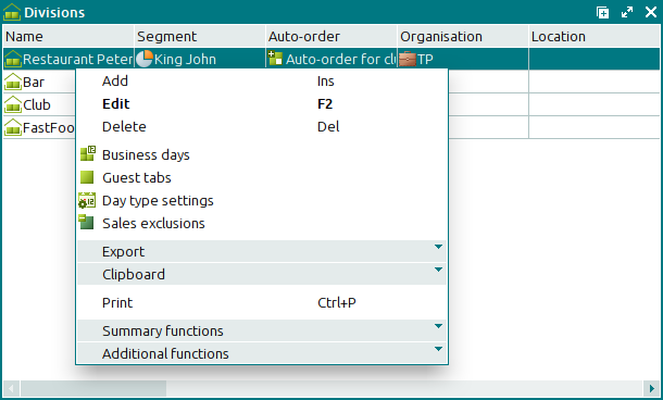
The standard context menu of a data grid contains the following commands (their keyboard shortcuts are specified in brackets):
(Ins) – adds items to the data grid.
(F2) – modifies (edits) the existing items of the data grid.
If the item is read-only, the command is replaced by the command.
(Del) – deletes items and groups of items from the data grid.
(Ctrl+P) – prints print layouts with the information from the data grid.
and system menus:
– combines commands to export data grid items to a file or update package.
– contains all commands to calculate the summary values for the data grid columns.
– combines commands to manage the appearance of the data grid and to save data to an external file.
and sometimes the following menus:
– combines commands to change the statuses of the data grid items.
– combines commands to operate the clipboard.
The context menu can also contain other commands available for the given menu items.
For your convenience, you can customise the appearance of data in the data grid, i.e.:
hide columns, change their width and positioning, expand and collapse tree list elements, show and hide groups using the mouse or commands from the menu,
sort the data in grids by one or more columns by dragging the header of the required column to the area above the data grid,
calculate summary functions using the menu commands.
If one or more functions are selected from the menu, the summary functions area appears in the window. It displays function values (total, minimum, maximum, quantity, average), which have been calculated for the data grid columns.
For data grids that allow grouping, you can display function values both for the entire data grid and for each separate group.

All sorting, filter, context search, and other operations are available in the data grid. For more information on how to work with data grids, please refer to the chapter.
If any items of the data grid are inaccessible to a given user, they will not be displayed. If only one particular field is unavailable to the user, the name of this field will appear in angle brackets in blue, for example: <Device>.

When you delete items from the data grids, a confirmation dialog appears. Deleted directory contents are moved to the , but the elements of lists, logs, settings directories etc. are deleted permanently.
You can send information to print by creating print layouts based on data in the grids. The command opens the window from the context menu of any data grid:
The appearance of the document to be printed can be set up in the print layout design. Print layouts can be designed in the FastReport report generator (editor).

To navigate to the print layout editing mode, select the command from the context menu of the Print panel.

All print layouts are stored in one database grid. Print layouts can use each other's elements. Print layouts of any objects of the system can be inherited. When print layouts are inherited, only the actual design is passed on; the scripts and event handlers are not inherited.
You can add or edit data grid items by using entry windows ??? or editor windows, respectively.
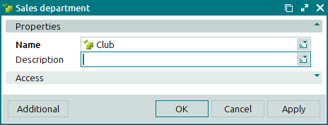
The window contains fields, buttons, and, in some cases, data grids (specifications). Data in a window can be grouped on multiple panels.
In order to save an item in a data grid, all required fields must be filled out. The names of required fields are in boldface. To save data, press the or button.
Possible functions of the buttons in the windows:
– closes the window and saves data,
– closes the window without saving data,
– saves data without closing the window,
– gives you a choice between:
– opens the Change log panel, which displays all changes that have been made to the item,
– deletes the item from the data grid.
– adds the next item to the data grid,
– navigates to the next data grid item so that it can be edited,
– navigates to the previous data grid item so that it can be edited,
– closes the viewing windows.
Fields in the windows can have icons. When you hover your mouse over the icon, a tooltip will appear:
error icon
 – incorrect data entry or incorrect change made to data in the field. To fix the error, follow the directions in the tooltip and perform the necessary operation.
warning icon
 – incorrect number of digits after the decimal point (this is applicable when you enter a numeric value). When saved to the database, the number will be rounded.
notification icon
 – additional information available for the entered value.